Freewrite


,
,
,
,
,
,
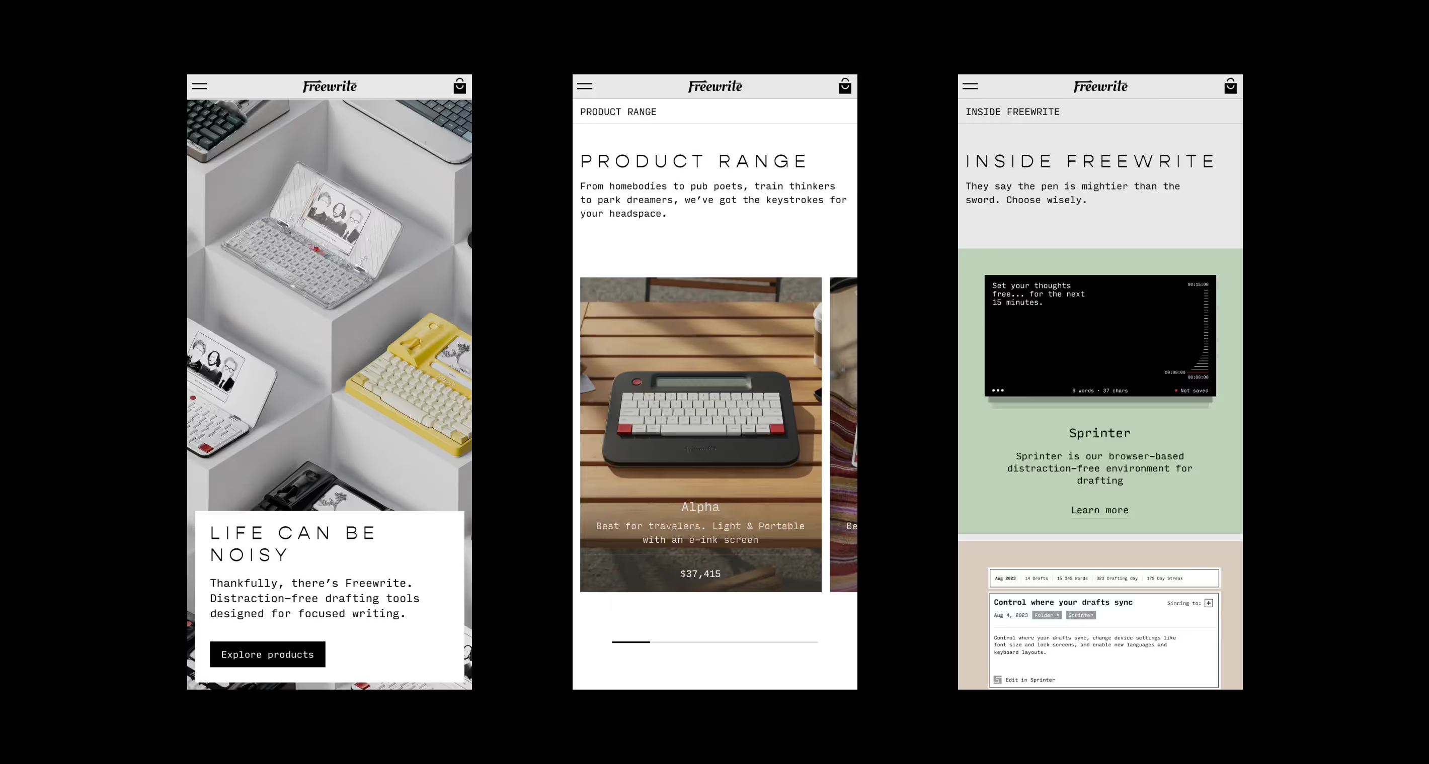
Freewrite is a distraction-free tool that helps writers stay focused during the creative process. O0 Design helped Freewrite build a distinct branding and a website that allows the customers to feel the atmosphere behind the brand’s products.
Got 2 awards:
Red Dot
,
ED Awards
,
“After the redesign, total sales increased by 52%.”


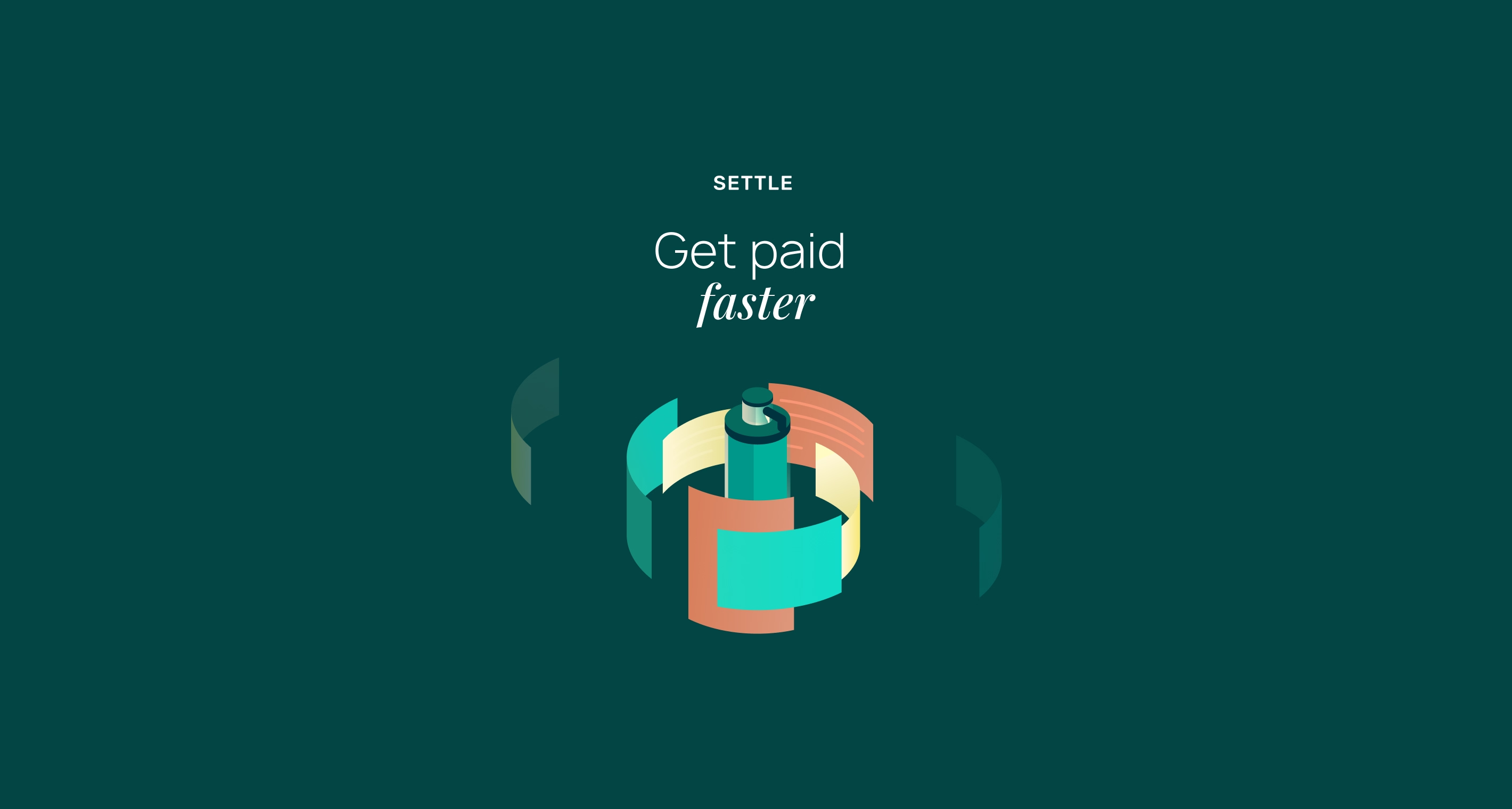
We made Freewrite’s branding more diverse and unique by adding light pastel colors to the existing black, red, and grey color schemes. To make things even more interesting, we created a series of 50+ monochrome isometric illustrations used in the brand’s website design and social media.


Freewrite is a mix of analogue and digital, and their website represents that. We went for a reserved and elegant approach, adding interactive models, videos, and illustrations to spice things up and show that Freewrite is a modern and innovative brand.

.avif)
O0 Design created an interactive 3D model for each of Freewrite’s products. These models allow customers to preview every device in detail before purchasing them.
To make the user shopping experience even more interactive and entertaining, we created 3D animated scenes for product cards. When a customer hovers on a card, the product moves closer to them. We’ve also made videos for all devices, allowing potential customers to learn about the advantages of each product.


Freewrite’s branding is simple but not at all plain. One thing that makes it stand out is its black-and-white isometric illustrations that complement the brand’s colours, showcase certain product features, and look eye-catchy.


“I'm happy with the final end product that the O0 team produced. Special stand-out performance from the account management team.”
Let’s talk





.png)


.avif)
.avif)








%20(1).webp)












.webp)


